Today I am reining myself in and making me work on things with a closer deadline.
I forgot to take a photo of the collage before I adhered the paper, so this is an older dark one...but it is how the collage looked.
This is a collage that I submitted for consideration and didn't get juried into a different show earlier this year.
I
like this guy, but since I have been working with the repurposed
canvases more I realize I can do more to make the foxish-creature stand
out from the background. I am working on him today and I will try him
in another upcoming juried show.
For anyone who is keeping track, this is canvas #4.
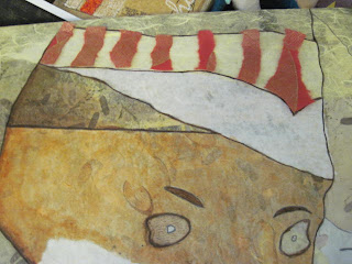
I wanted to make his hat look more like a hat and be easier for the viewer to see what I am seeing.
I didn't want to paint the areas because I didn't want to not be able to make changes and didn't want the surface to get too thick...I wanted it to stay somewhat transparent enough to still be able to see the collage (and painting) underneath the images.
I made a pattern of one of the sections of the hat with butcher paper (because it was handy and I could see through it).
I placed the pattern on this decorative paper. I like the red background with the gold leaves and I was thinking it would be small enough pieces not to be able to see the whole design on the paper. (Still with me?)
I tore pieces of the cut-out paper and laid them onto the area. Okay, but not quite "it".
I did myself a favor and found an actual piece of tracing paper. Then I cut out another pattern from a decorative blue paper that has inclusions in it.
I tore pieces again and I like this better.
It isn't as jarring as the red, but it is still pretty stark.
I adhered the torn bits of paper to the area with gel medium.
I like it. I like the way the torn edges are sort of feathery and not cut-looking.
What next?
I knew I still had some of the polka dot tissue paper that I used in other collages. I think it will work well here because it will be more transparent and be in the same sort of color range.
I also cut out a piece of purple paper with inclusions to try out on the top of the hat.
I laid down the polka dot paper with gel medium and I really, really like it. I like the separation between the stripes and the dots and I like the white part of the hat (I think).
I love the way that the polka dot paper allows you to almost see through it to the layer below. You can see my shading that I was so happy with, and you can still see part of a tree from the original painting...in person you can, anyway.
The purple is still not a "go" yet...I think it might be too solid. The color is okay, but I don't know...
I cut out a piece of almost olive mulberry paper.
I was thinking maybe the creature's shirt will partially match the top of his hat. Again...still not sure...but this is what I've got so far.


No comments:
Post a Comment